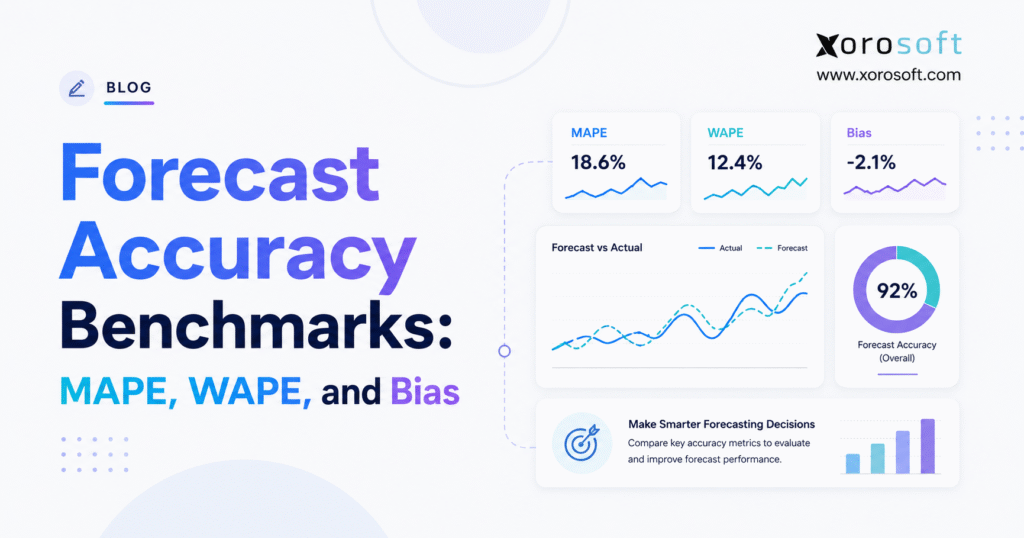
When evaluating forecasting performance, it is important to consider forecast accuracy benchmarks as a reference point.
1. Why Forecast Accuracy Benchmarks Often Mislead Inventory Teams
A company can report strong forecast accuracy and still face stockouts, excess inventory, emergency purchase orders, and poor warehouse availability. In many cases, the conflict starts when leaders rely on one percentage without asking what the number measures, how the team calculated it, or which decisions it supports.
For example, a company-level score may look healthy because an over-forecast in one category offsets an under-forecast in another. Similarly, a category forecast may appear accurate while the most important sizes, colors, locations, or sales channels remain consistently wrong. As a result, the dashboard celebrates success while purchasing and warehouse teams continue to manage shortages, transfers, markdowns, and supplier escalations.
Forecast accuracy benchmarks help only when they reflect the business context behind the forecast. Therefore, a useful benchmark must account for forecast horizon, demand volatility, sales volume, product lifecycle, location detail, channel mix, and the cost of error. If a business compares unrelated products or different horizons, it will create a misleading target.
MAPE, WAPE, and forecast bias reveal different parts of the picture. MAPE shows the average percentage size of individual errors. In contrast, WAPE shows total absolute error relative to total actual demand. Meanwhile, forecast bias shows whether planners consistently forecast too high or too low. Together, these metrics help teams separate random variation from a repeatable planning problem.
The best forecasting process does not ask only, “What percentage did we achieve?” Instead, it asks, “Did the forecast support the purchase order, replenishment, allocation, production, or cash-flow decision that the business needed to make?
2. How Demand Forecast Accuracy Benchmarks Work in Practice
Forecast accuracy benchmarks give teams a reference point for evaluating forecasting performance. A company may compare a new model with a simple baseline, the previous forecasting method, a similar product segment, or the operating result that followed the forecast.
However, teams must define the comparison before they interpret the result. Otherwise, two departments may report different accuracy percentages even though they evaluate the same demand history.
2.1 Forecast Accuracy and Forecast Error Answer Different Questions
Forecast error measures the numerical difference between actual demand and forecast demand. Forecast accuracy, on the other hand, describes the overall quality, scale, consistency, and business impact of those errors.
Some companies report accuracy as 100% minus an error percentage. Others report MAPE or WAPE directly. Consequently, teams may struggle to compare dashboards. A report that says “90% accuracy” may represent a 10% WAPE, a 10% MAPE, or an internal formula that no other department uses.
Therefore, leaders should require every dashboard to display the metric name, formula, forecast horizon, time bucket, and reporting level. For instance, “monthly SKU-level WAPE at a two-month horizon” gives managers far more information than “forecast accuracy: 90%.”
2.2 Forecast Horizon Changes the Benchmark
A forecast created seven days before demand occurs can use recent sales, confirmed orders, current promotions, and new market signals. By comparison, a forecast created six months earlier must work with much greater uncertainty.
Teams should therefore compare like-for-like horizons. They should not compare a one-week replenishment forecast with a six-month purchasing forecast and call the difference a model failure. After all, each horizon supports a different decision and requires its own benchmark.
Moreover, businesses should preserve every forecast horizon separately. This practice helps managers understand whether accuracy declines gradually or drops sharply after a specific planning window.
2.3 Product, Channel, and Warehouse Detail Changes Forecast Difficulty
Forecasts usually become less stable as teams add more detail. Company-level demand may follow a predictable pattern, while demand for one SKU at one warehouse may appear sparse or erratic. Likewise, one sales channel may respond differently to promotions, price changes, marketplace trends, or customer behavior.
The benchmark must match the level at which the business makes decisions. Finance may need company or category forecasts. Purchasing, however, needs SKU-level information. Warehouse teams need location-level demand. Ecommerce teams may also need channel-level forecasts before they consolidate demand against a shared inventory pool.
As a result, businesses should review forecasting performance at several levels instead of choosing one aggregate percentage.
3. MAPE Forecast Accuracy Benchmarks: Formula, Use Cases, and Limits
Mean absolute percentage error, or MAPE, measures the average absolute forecast error as a percentage of actual demand. Managers often favor MAPE because percentages feel intuitive and allow comparisons across products with different unit volumes.
Nevertheless, MAPE works well only under specific conditions. Therefore, teams should understand both its strengths and its limitations before they make it a primary KPI.
3.1 How to Calculate MAPE Forecast Accuracy
Use this formula:
MAPE = (1 ÷ n) × Σ |Actual Demand − Forecast Demand| ÷ |Actual Demand| × 100Consider four periods:
| Period | Actual demand | Forecast demand | Absolute error | Percentage error |
|---|---|---|---|---|
| Period 1 | 100 | 110 | 10 | 10.00% |
| Period 2 | 120 | 130 | 10 | 8.33% |
| Period 3 | 80 | 90 | 10 | 12.50% |
| Period 4 | 150 | 160 | 10 | 6.67% |
The calculation produces a MAPE of 9.38%. In other words, the forecast differed from actual demand by an average of 9.38% across the four periods.
Although the formula looks simple, teams must apply it consistently. For example, they should use the same treatment for returns, cancellations, missing demand, and stockout periods.
3.2 When MAPE Gives Managers a Useful View
MAPE works best when actual demand stays positive and the compared items share similar demand characteristics. For this reason, teams often use it for stable products, repeat-purchase categories, and time series that rarely contain zero-demand periods.
In addition, MAPE gives each valid observation equal influence. That feature helps when managers want to compare percentage performance across similar products. However, it can distort a portfolio view when products differ significantly in volume.
For example, a forecast of four units against actual demand of two units creates a 100% error. By contrast, a forecast of 1,900 units against actual demand of 2,000 units creates only a 5% error. MAPE may give both observations equal weight even though the second product creates a much larger inventory decision.
Therefore, managers should avoid using MAPE as the only portfolio metric.
3.3 Why Zero Demand Breaks MAPE
MAPE divides forecast error by actual demand. When actual demand equals zero, the formula divides by zero and cannot produce a valid result. Likewise, when actual demand approaches zero, the percentage can become extremely large.
Consequently, MAPE becomes a weak standalone metric for spare parts, new products, slow-moving inventory, and intermittent SKU-location demand. In those situations, teams should consider MAE, MASE, RMSSE, service-level measures, or inventory-based performance indicators.
Moreover, managers should document how they treat returns, cancellations, stockout periods, and negative actual values. Otherwise, silent data exclusions can make the reported result look better without improving the forecast.
4. WAPE Forecast Accuracy Benchmarks: A Volume-Weighted View
Weighted absolute percentage error, or WAPE, divides total absolute forecast error by total actual demand. Unlike MAPE, it gives high-volume observations more influence. Therefore, it often suits portfolio, category, division, and company-level reporting.
4.1 How to Calculate WAPE Forecast Accuracy
Use this formula:
WAPE = Σ |Actual Demand − Forecast Demand| ÷ Σ |Actual Demand| × 100Using the same four-period dataset, the business records 40 units of total absolute error and 450 units of total actual demand. As a result, the calculation produces a WAPE of 8.89%.
MAPE and WAPE differ because they weight the observations differently. MAPE averages individual percentage errors. WAPE, in contrast, compares total absolute error with total demand.
4.2 When WAPE Supports Better Portfolio Decisions
WAPE helps when leaders want high-volume products to carry more weight in the final score. Therefore, a business can use it for executive dashboards, supplier planning, category reviews, and portfolio-level trend analysis.
Furthermore, WAPE handles some individual zero-demand observations, provided total actual demand across the evaluation set remains greater than zero. Consequently, it may work better than MAPE for certain aggregated datasets.
However, managers should still review the calculation period. If they compare a peak-season month with an off-season month, the changing denominator may affect the result.
4.3 What WAPE Can Hide From Planners
WAPE can create false confidence when a small group of high-volume products forecasts well. Meanwhile, low-volume items may contribute little to the final score even when they create customer-service problems, production delays, or contractual risk.
For instance, a low-volume replacement part may barely affect portfolio WAPE. Nevertheless, a shortage could stop equipment or damage an important customer relationship. Managers should therefore pair WAPE with segment-level analysis and a list of high-impact exceptions.
WAPE can also move as the demand level in the evaluation period changes. As a result, strong trends, seasonality, or changing variance may reduce the metric’s comparability across periods. Teams should compare consistent windows and consider MASE or RMSSE when they need a scale-free benchmark against a naïve forecast.
5. Forecast Bias Benchmarks Expose Directional Inventory Risk
MAPE and WAPE measure error size, but they ignore direction. Forecast bias, however, shows whether the organization consistently forecasts above or below actual demand.
5.1 How to Calculate Forecast Bias
One common formula uses forecast minus actual demand:
Forecast Bias % = Σ (Forecast Demand − Actual Demand) ÷ Σ Actual Demand × 100Under this convention, positive bias means over-forecasting, while negative bias means under-forecasting.
In the four-period example, every forecast exceeds actual demand by ten units. Therefore, the total signed error equals 40 units, and the forecast bias equals positive 8.89%.
5.2 Why Bias Must Sit Beside MAPE or WAPE
Imagine another forecast with the same absolute errors. Two periods run ten units high, while two periods run ten units low. MAPE and WAPE remain unchanged. However, the signed errors cancel and produce zero bias.
The second forecast still contains error, but it does not lean consistently in one direction. That difference matters because persistent over-forecasting can build excess inventory. Conversely, persistent under-forecasting can increase stockouts and expediting.
Therefore, a practical dashboard should show one absolute error metric and one directional metric. WAPE or MAPE tells leaders how large the errors are. Bias, meanwhile, tells them whether the errors keep pushing the business toward the same operational outcome.
5.3 Document the Sign Convention
Some systems calculate forecast minus actual demand. Others calculate actual demand minus forecast. As a result, those formulas reverse the sign.
Managers should therefore label the result as “over-forecast bias” or “under-forecast bias” instead of relying only on a positive or negative symbol. Clear labels prevent planning, finance, and executive teams from interpreting the same number in opposite ways.
6. How MAPE, WAPE, and Bias Strengthen Forecast Accuracy Benchmarks
MAPE, WAPE, and forecast bias do not compete for one position on the dashboard. Instead, each metric answers a different management question.
| Metric | Business question | Strongest use | Main limitation |
| MAPE | What is the average percentage error? | Stable demand with positive actual values | Zero demand breaks the calculation |
| WAPE | What is total absolute error relative to total demand? | Volume-weighted portfolio reporting | High-volume items can hide long-tail errors |
| Forecast bias | Do forecasts consistently run high or low? | Directional planning risk | Opposing errors can cancel |
| MASE | Does the forecast beat a naïve baseline? | Cross-series and intermittent-demand analysis | Requires a defined scaling baseline |
| RMSE | How strongly should the business penalize large misses? | Environments where major errors carry high cost | Scale-dependent and less intuitive |
6.1 Build a Forecast Accuracy Metric Portfolio
An executive dashboard may show company-level WAPE and bias. Meanwhile, category managers can review WAPE, MAPE, or MASE by segment. Purchasing and replenishment teams can then examine the SKUs and locations that contribute most to error, service risk, or excess inventory.
This layered structure gives each team the detail it needs without losing the company-wide view. In addition, it prevents one metric from hiding a problem that another metric would expose.
For example, a strong WAPE may indicate that the company’s high-volume products perform well. However, a high SKU-level MASE may reveal serious long-tail instability. Similarly, a reasonable absolute error score may still sit beside a persistent positive bias.
6.2 Match the Metric to the Cost of Error
Under-forecasting and over-forecasting do not always carry the same cost. For instance, a shortage on a readily available, low-margin item may create a minor inconvenience. In contrast, a shortage on a long-lead-time component may stop production.
Over-forecasting also creates different consequences across industries. A nonperishable staple may tolerate excess stock. However, a seasonal fashion product, fresh food item, or technology product may lose value quickly.
Therefore, teams should review forecasting measures with service levels, lost sales, carrying costs, obsolescence, supplier commitments, and margin exposure. Statistical accuracy matters most when it helps the business control those outcomes.
7. How to Set Good Forecast Accuracy Benchmarks
No universal MAPE, WAPE, or accuracy percentage applies to every product, industry, horizon, and business model. For example, a 20% WAPE may signal weak performance for a stable, high-volume product with years of clean history. However, the same result may represent useful performance for a new product or intermittent SKU-location demand.
7.1 Start With an Internal Baseline
The strongest first benchmark usually comes from the company’s own data. Therefore, compare the new forecasting method with a simple baseline, such as last period’s demand or demand from the same period last year.
Next, compare the new method with the previous process. A complex model that cannot outperform a naïve forecast may add effort without improving decisions.
Furthermore, teams should compare products within similar demand segments. Stable and intermittent products should not share one target because they present different forecasting challenges.
7.2 Use Internal Error Bands for Triage, Not Universal Claims
The following ranges can support internal review:
| Forecast error | Internal interpretation | Management response |
| Below 10% | Strong for many stable or aggregated series | Check whether detail-level errors remain hidden |
| 10%–20% | Potentially usable | Review bias, service level, and baseline improvement |
| 20%–30% | Material uncertainty | Segment products and investigate major exceptions |
| Above 30% | High error | Review the method, horizon, demand pattern, and data quality |
These ranges do not represent universal industry standards. Instead, they help managers prioritize investigation when the business applies them consistently to comparable products and horizons.
For example, a business may classify a 15% WAPE as acceptable for one seasonal category. However, it may treat the same score as weak for a stable replenishment item.
7.3 Compare Forecast Accuracy at Several Levels
Company-level accuracy supports financial and capacity planning. Category-level accuracy supports merchandising and supplier decisions. SKU-level accuracy supports purchasing. Finally, SKU-location accuracy supports replenishment and allocation.
A strong company-level result should trigger deeper review rather than end the discussion. After all, leaders need to know whether the forecast placed the right product in the right location at the right time.
7.4 Track the Baseline and the Business Outcome
A forecast should beat a reasonable baseline and improve an operating decision. Therefore, a lower WAPE that does not reduce shortages, excess stock, or expediting may offer limited value.
Managers should connect forecast performance measures with inventory turns, service level, working capital, write-offs, purchase-order changes, and production stability. As a result, the team remains focused on business performance instead of score optimization.
8. Forecast Accuracy Benchmarks by SKU, Warehouse, and Sales Channel
Inventory-driven businesses rarely manage one simple demand stream. Instead, the same SKU may sell through Shopify, Amazon, wholesale accounts, retail stores, EDI customers, and direct sales while drawing from one or several warehouses.
8.1 Multi-Warehouse Forecast Accuracy Needs Location-Level Data
A national forecast may predict total demand correctly and still place inventory in the wrong locations. Consequently, one warehouse accumulates excess stock while another transfers inventory or misses orders.
Location-level forecasting should reflect regional demand, transfer options, lead times, warehouse capacity, supplier routes, and service requirements. The business should then reconcile those forecasts with category and company totals.
A warehouse system such as XoroWMS can centralize real-time inventory, receiving, replenishment, transfer, and fulfillment information. Therefore, planners can more easily separate a demand forecast problem from an inventory-record, allocation, or execution problem.
8.2 Channel-Level Forecasting Prevents False Aggregation
Shopify, Amazon, wholesale, retail, and EDI demand can follow different patterns. For example, promotions, paid media, marketplace ranking, returns, customer contracts, and channel-specific assortments all change the demand signal.
Teams should first evaluate each major channel and then reconcile the forecasts against shared inventory. The Xorosoft ERP app on Shopify connects orders, products, variants, inventory, payouts, and operational data. As a result, it can create a more consistent planning foundation. Nevertheless, managers still need suitable metrics, horizons, and exception rules.
8.3 Product Hierarchies Need Reconciliation
SKU forecasts should add up logically to product, category, and company totals. Similarly, location forecasts should align with regional and network demand.
A forecasting process that ignores hierarchy may produce accurate totals with unrealistic detail. Therefore, planners should reconcile the levels without erasing meaningful local variation.
9. Forecast Accuracy Benchmarks by Industry
Industry context changes both forecasting difficulty and the cost of error. Consequently, the same result carries different meaning in apparel, furniture, food, wholesale distribution, and manufacturing.
9.1 Apparel Forecast Accuracy by Style, Color, and Size
Apparel demand spreads across style, color, size, season, channel, and location. Therefore, a style-level forecast may look accurate while popular sizes stock out and slower variants accumulate.
Planners should review style-level accuracy for buying decisions and variant-location accuracy for allocation. In addition, they should separate new collections from established replenishment products because new collections lack reliable history.
9.2 Furniture and Home Goods Forecast Accuracy
Furniture companies often manage long supplier lead times, bulky stock, regional preferences, and limited warehouse capacity. As a result, persistent over-forecasting can tie up storage space and working capital for months.
Bias deserves close attention because an optimistic forecast may influence container planning, supplier commitments, cash flow, and warehouse capacity long before the business sells the product.
9.3 Sporting Goods and Seasonal Demand Accuracy
Sporting-goods demand can change with weather, team schedules, school calendars, tournaments, seasons, and major events. Therefore, planners should compare forecasts within relevant seasonal windows and preserve the assumptions behind event-based overrides.
Moreover, the team should measure whether manual adjustments improved the baseline. If repeated overrides reduce accuracy, they add process without adding value.
9.4 Food and Beverage Forecast Accuracy
Food and beverage companies balance availability with shelf life, expiry, batch requirements, and waste. Over-forecasting can create spoilage, while under-forecasting can reduce product availability and disrupt production.
Therefore, managers should review forecast error with waste, freshness, service level, and production yield. A lower WAPE matters only when it supports better inventory and operating outcomes.
9.5 Wholesale Distribution and Manufacturing Accuracy
Wholesale demand may shift because of large customer orders, pricing agreements, EDI activity, contracts, and customer-specific assortments. Manufacturing, meanwhile, adds bills of material, component availability, production lead times, capacity, and work orders.
Xorosoft outlines industry-specific operational requirements across apparel, manufacturing, distribution, food, sporting goods, and other product sectors on its industries page. Industry segmentation should not create artificial universal targets. Instead, it should help managers choose metrics that reflect how the business buys, makes, stores, and sells inventory.
10. How Forecast Accuracy Benchmarks Affect Inventory and Working Capital
Forecast error becomes commercially important when it changes purchasing, production, allocation, cash flow, or customer service. Therefore, leaders should connect statistical results with operating consequences.
10.1 Under-Forecasting Creates Stockouts and Hidden Demand
Under-forecasting can increase stockouts, emergency purchasing, expedited freight, backorders, and missed sales. Furthermore, it can distort the demand history that feeds the next forecast.
When inventory runs out, recorded sales may fall below true customer demand. If planners treat constrained sales as complete demand, they may continue to underestimate the product. Therefore, teams should flag stockout periods and estimate lost demand when reliable evidence exists.
10.2 Over-Forecasting Creates Excess Inventory and Cash Pressure
Over-forecasting can increase carrying costs, storage pressure, markdown exposure, obsolescence, and cash tied up in stock. Seasonal products, fresh products, and short-lifecycle items carry especially high risk.
Bias helps managers determine whether excess inventory comes from isolated misses or a repeated planning pattern. For example, persistent positive bias may reflect optimistic sales assumptions, poor promotion estimates, or incentives that reward availability without measuring inventory cost.
10.3 Forecast Accuracy Must Guide Purchasing
Purchasing teams should combine the demand forecast with available inventory, allocated stock, open sales orders, open purchase orders, supplier lead times, minimum order quantities, order multiples, and expected receipts.
Otherwise, a forecast dashboard creates little value. The organization must translate the analysis into purchase-order changes, transfer decisions, safety-stock policies, or production plans.
11. Data Quality Determines Whether Forecast Accuracy Benchmarks Mean Anything
A business cannot measure forecast performance reliably without historical forecast versions, consistent product identifiers, accurate inventory records, and dependable demand data.
Therefore, data governance should form part of the forecasting process rather than sit outside it.
11.1 Preserve the Original Forecast Snapshot
The business should store the product, location, channel, time bucket, forecast quantity, creation date, approval date, and horizon for every relevant forecast.
Teams often overstate performance when they compare actual demand with a forecast that they revised shortly before the period ended. Instead, the correct comparison uses the forecast that existed when the business made the purchasing, production, or allocation decision.
Moreover, preserving several horizons helps managers see how forecast quality changes as the planning date approaches.
11.2 Separate Forecast Errors From Execution Errors
A shortage does not automatically prove that the forecast failed. For example, a delayed purchase order, receiving mistake, inaccurate inventory record, transfer delay, picking issue, production shortfall, or allocation rule may have caused the problem.
Similarly, excess inventory can come from supplier minimums, cancelled orders, returns, or weak execution rather than the forecast itself.
Managers therefore need one view of inventory, purchasing, warehouse, sales, manufacturing, and accounting data. XoroONE brings those operating areas together in a cloud ERP environment. As a result, a connected data model can reduce reconciliation work around forecasting. Nevertheless, disciplined definitions and review processes still determine whether the metrics remain trustworthy.
11.3 Use One Data Dictionary
Teams should agree on product hierarchies, warehouse definitions, channel names, time buckets, return treatment, stockout treatment, and the meaning of actual demand.
Otherwise, finance, sales, purchasing, and operations may calculate different versions of the same KPI. Therefore, a shared data dictionary should support every forecast accuracy report.
12. Improve Forecast Accuracy Benchmarks Without Gaming the Score
A business improves forecasting when it improves the model, data, process, and decisions around the forecast. It should not improve the score by changing the evaluation window, excluding difficult products, or aggregating away the problem.
12.1 Start With a Simple Forecast Baseline
Every forecasting method should compete against a simple reference. For stable demand, last period may provide a useful baseline. For seasonal demand, however, the same period last year may work better.
A complex model creates value only when it consistently outperforms the reference or improves the operating decision. Therefore, teams should record both the baseline and the selected model. MASE can help because it scales error against a naïve method.
12.2 Segment Products by Demand Behavior
Teams should group products by volume, value, variability, margin, lifecycle, lead time, service importance, and stockout impact.
For example, high-volume stable products may support automated forecasting and exception thresholds. Seasonal products need calendar and event inputs. New products require analogs and frequent review. Intermittent products, meanwhile, often require different metrics and inventory policies.
Consequently, segmentation prevents the business from forcing every product into one model and one target.
12.3 Measure Forecast Value Added
Forecast value added asks whether each intervention improves the result. Therefore, the team should measure sales overrides, management adjustments, promotional assumptions, and planning meetings against the baseline.
If repeated overrides make the forecast worse, managers should redesign or remove that step. On the other hand, if a sales team consistently improves forecasts for certain accounts, the business should formalize that input.
12.4 Turn Each Exception Into an Action
A monthly review should identify the products that contribute most to absolute error, the items with persistent bias, and the exceptions with the largest commercial impact.
Next, each exception should lead to a decision. The team may change an assumption, revise a purchase order, review a lead time, adjust allocation, change safety stock, or investigate data quality.
Ultimately, the objective does not involve producing a perfect forecast. Instead, it involves reducing avoidable uncertainty and making better decisions with the uncertainty that remains.
13. When ERP Forecasting Becomes More Practical Than Spreadsheets
Spreadsheets can work well when the catalog remains small, demand stays stable, one person owns the process, and the team preserves forecast versions carefully.
However, complexity rises when multiple teams maintain separate files, formulas break, historical versions disappear, and staff manually combine Shopify, Amazon, wholesale, EDI, warehouse, and accounting data.
13.1 Signs That the Forecasting Process Has Outgrown Spreadsheets
A business should evaluate a more structured system when purchasing and sales use different forecasts, warehouse-level demand remains unreliable, inventory records require constant reconciliation, or planners cannot connect forecast insights with purchase orders and production plans.
Revenue or SKU count alone does not determine the need for ERP. Instead, operational complexity and the cost of disconnected decisions provide a better guide.
13.2 Connect Demand Planning With ERP Operations
XoroERP connects accounting, reporting, vendor management, procurement, warehousing, manufacturing, and forecasting-related workflows in one environment. Therefore, it can help when a company needs demand planning to influence purchasing, materials, production, fulfillment, and financial reporting.
Businesses that compare broader enterprise platforms should examine implementation requirements, workflow fit, integrations, reporting, warehouse functionality, manufacturing depth, support, and total ownership needs. The Xorosoft versus NetSuite comparison provides one evaluation starting point. However, each company should validate vendor claims against its own requirements and current proposals.
14. Forecast Accuracy Benchmarks FAQs
14.1 What Is Forecast Accuracy?
Forecast accuracy describes how closely forecast demand matches actual demand. Teams evaluate it with MAPE, WAPE, MAE, MASE, RMSE, bias, and other measures. Therefore, the chosen metric should fit the demand pattern, forecast horizon, reporting level, and business decision.
14.2 What Are Forecast Accuracy Benchmarks?
Forecast accuracy benchmarks give a company reference points for judging forecasting performance. For example, useful references include a naïve forecast, the previous method, comparable product segments, internal targets, service levels, and inventory outcomes.
14.3 How Do Teams Calculate Forecast Accuracy?
Teams compare forecast demand with actual demand and calculate the difference. Next, they express the error in units, percentages, scaled values, or squared values. Most importantly, the business should use the forecast that existed at the original decision point.
14.4 What Is a Good Forecast Accuracy Percentage?
No universal percentage applies to every product or business. Instead, managers should consider demand volatility, horizon, aggregation, lifecycle, volume, and data quality. They should also compare like-for-like forecasts with a baseline and the operational cost of error.
14.5 What Is MAPE in Forecasting?
MAPE means mean absolute percentage error. It calculates the average absolute forecast error as a percentage of actual demand. However, it works best with positive actual values and stable demand.
14.6 How Do Teams Calculate MAPE?
First, subtract the forecast from actual demand. Next, take the absolute value, divide by actual demand, and multiply by 100. Finally, average the valid percentage errors.
14.7 Is a Lower MAPE Better?
A lower MAPE generally signals smaller average percentage errors. However, managers should compare results only when the products, horizons, aggregation levels, formulas, and data treatments remain consistent.
14.8 Why Does MAPE Fail With Zero Demand?
MAPE divides error by actual demand. Therefore, zero actual demand creates division by zero, while very small actual demand can produce extreme percentages. In those cases, teams should use another metric.
14.9 What Is WAPE in Forecasting?
WAPE means weighted absolute percentage error. It divides total absolute forecast error by total actual demand. As a result, it gives high-volume observations more influence.
14.10 How Do Teams Calculate WAPE?
First, add all absolute forecast errors. Then, divide that total by total actual demand and multiply by 100. However, total actual demand must remain greater than zero.
14.11 Is a Lower WAPE Better?
A lower WAPE generally indicates lower total absolute error relative to demand. Nevertheless, managers should still review product segments because strong high-volume products can hide long-tail problems.
14.12 Is WAPE the Same as Weighted MAPE?
Some businesses use the terms interchangeably. However, software products may define them differently. Therefore, managers should inspect the formula instead of relying on the label.
14.13 What Is the Difference Between MAPE and WAPE?
MAPE averages individual percentage errors and gives each valid observation equal influence. WAPE, in contrast, compares total absolute error with total demand and gives higher-volume observations more influence.
14.14 When Should a Business Use WAPE Instead of MAPE?
WAPE often suits portfolio or category reporting when volume weighting matters. MAPE, however, may suit comparable positive-demand series but performs poorly when actual values reach or approach zero.
14.15 What Is Forecast Bias?
Forecast bias measures whether forecasts consistently run above or below actual demand. Therefore, it complements MAPE, WAPE, or another absolute error metric.
14.16 How Do Teams Calculate Forecast Bias?
One common method subtracts actual demand from forecast demand, totals the signed errors, and divides by total actual demand. However, teams must document the formula because some systems reverse the subtraction.
14.17 What Does Positive Forecast Bias Mean?
Under a forecast-minus-actual formula, positive bias means over-forecasting. In contrast, under an actual-minus-forecast formula, positive bias means under-forecasting. Therefore, clear dashboard labels prevent confusion.
14.18 What Does Negative Forecast Bias Mean?
Under the formula in this article, negative bias means forecasts usually fall below actual demand. As a result, that pattern can increase shortage, expediting, allocation, and service-level risk.
14.19 What Is an Acceptable Forecast Bias?
Long-run bias should stay near zero. However, zero bias does not prove accuracy because positive and negative errors can cancel. Therefore, managers should review bias with an absolute error metric and business outcomes.
14.20 Can a Forecast Be Accurate but Biased?
Yes. A forecast may contain relatively small errors while consistently running slightly high or low. Consequently, bias exposes a directional pattern that absolute metrics may miss.
14.21 Should Teams Measure Forecast Accuracy by SKU?
Yes, when purchasing or replenishment decisions occur by SKU. However, teams should also review category, company, warehouse, and channel results to understand both detailed and aggregate performance.
14.22 Why Does Aggregate Forecast Accuracy Look Better?
Aggregation allows over-forecasts and under-forecasts to offset one another. In addition, stable high-volume products can dominate portfolio results and hide weaker long-tail performance.
14.23 How Does Forecast Horizon Affect Accuracy?
Longer horizons usually contain more uncertainty because more events can occur before the business realizes demand. Therefore, teams should measure and benchmark each horizon separately.
14.24 How Does Forecast Accuracy Affect Inventory?
Forecast error influences purchasing, safety stock, replenishment, allocation, production, working capital, and customer service. Moreover, supplier lead times, order rules, margins, and service targets shape the final impact.
14.25 When Should a Business Upgrade Its Forecasting System?
A business should consider an upgrade when teams lose forecast versions, use conflicting demand numbers, consolidate channels manually, struggle with warehouse-level planning, or cannot connect forecasts with purchasing and inventory execution.
15. Strategic Next Steps for Stronger Forecast Accuracy Benchmarks
MAPE, WAPE, and forecast bias give leaders different views of demand performance. MAPE explains average percentage error. WAPE, in contrast, provides a volume-weighted view of total error. Bias shows whether planners consistently push the business toward too much or too little inventory.
Strong forecast accuracy benchmarks compare consistent horizons, preserve original forecast snapshots, separate products by demand behavior, and connect statistical results with inventory and financial outcomes. In addition, they help teams focus on the errors that carry real commercial consequences.
A business should begin with a clear baseline, track complementary metrics, and review high-impact exceptions. Next, the team should turn each finding into a purchasing, allocation, safety-stock, production, or data-quality action.
Ultimately, better forecasting does not mean removing all uncertainty. Instead, it means understanding uncertainty well enough to make stronger operational decisions.
When spreadsheets and disconnected applications prevent that level of coordination, an integrated ERP can provide a more dependable operating foundation. Companies can contact Xorosoft to review their forecasting, inventory, purchasing, warehouse, manufacturing, ecommerce, and accounting workflows. Most importantly, the discussion should start with the business process, data quality, and decision requirements rather than a generic software demonstration.
Recent Posts
-
 ERP Landed Cost Module vs Spreadsheet Calculations for Importers
 -
 How to Build an Open-to-Buy Plan for an Omnichannel Brand
 -
 Cold Storage WMS for Food and Beverage Distribution
 -
 ERP Buying Statistics 2026: Evaluation, Implementation, and Adoption Risks
 -
 How a Distributor Reduced B2B Order Exceptions Without Restricting Sales